Zoom Escape -- Post Mortem
So this is the first time I’m writing a post mortem for one of our games. What a weird word. Is our game dead? Am I writing an orbituary? Anyway, if was a fun journey, so let’s get into it:
The Idea:
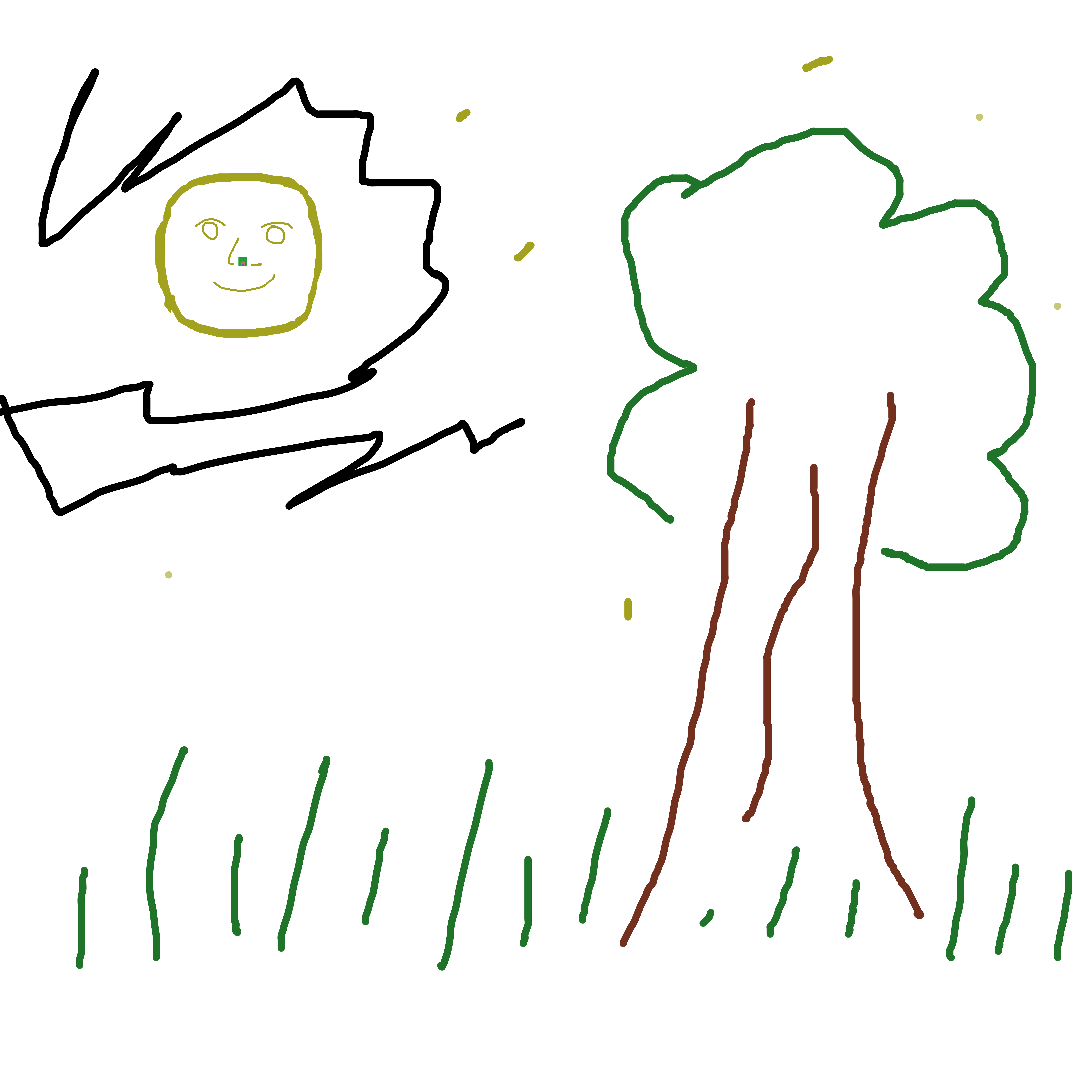
We made this game for the GMTK24 jam, but the idea for it was actually born a few months prior to that. Basically, I watched an „infinite zoom artwork“ video on YouTube and thought to myself: „Wouldn’t it be cool if you could actually explore something like that yourself?“
Skip ahead to the jam weekend. For us, the theme drops at 7pm and we usually spend the first evening brainstorming ideas and deciding on what game we want to make. This year’s theme was really exciting and while we usually struggle to come up with a single idea we both like, this time, we had collected about four (very rough) ideas after two hours.
We decided that we had to choose one and eventually settled on the endless zoom idea combined with a classic point and click escape game inspired by games like the Rusty Lake or Submachine series (a genre my girlfriend had been wanting to do a proper game in for a long time). Another source of inspiration was the „Powers of 10“ video, which you can maybe see inside a certain rodent’s nose. With some very rough ideas of how we wanted our world to look like, we went to bed for the night.
The Technical Aspects:
I had already thought a bit about the technical implementation before the jam and quickly realized this would be more of a technical challenge than what would maybe be apparent on the outside. Because I’m a massive nerd, this section ended up pretty long, so feel free to skip it if you’re not interested in the technical stuff.
One challenging requirement I knew we wanted to meet would be zooming in to an arbitrary degree without the graphics becoming pixelated.
One option we considered to do that was to use vector graphics, which are scalable by their very definition. Doing some research afterwards, it seems like a lot of those infinite zoom artworks actually are made using a vector graphics program, but we ended up deciding on using raster graphics, both because we were more comfortable with raster graphics art programs and with using raster graphics renderers.
The next „problem“ I wanted to solve was that, while the ambitiousness of our projects has increased over the last two years, so have the load times. Seeing that we would need like 30 very high-res images, I decided that I wanted to implement a dynamic loading technique so that only a couple of textures would need to be loaded pre-game and everything else would load while playing.
Overall, this worked out pretty well. There is a little stuttering here and there, maybe more if you have a bad interenet connection, but overall, we didn’t get any complaints about that at all. So that one was defnitely a win.
Another (literally) large problem were image sizes. If we wanted to have a 1024x1024 screen where you could zoom in to 8x it’s original size, our base images would need to have 16384x16384 pixels – too much to handle for both Krita running on my laptop and Procreate running on my girlfriend’s tablet. So we decided to cut everything in half. Which made for a very small screen size, something not every player was happy about, but I actually sort of like the way it resembles one of those old flash escape games à la Submachine.
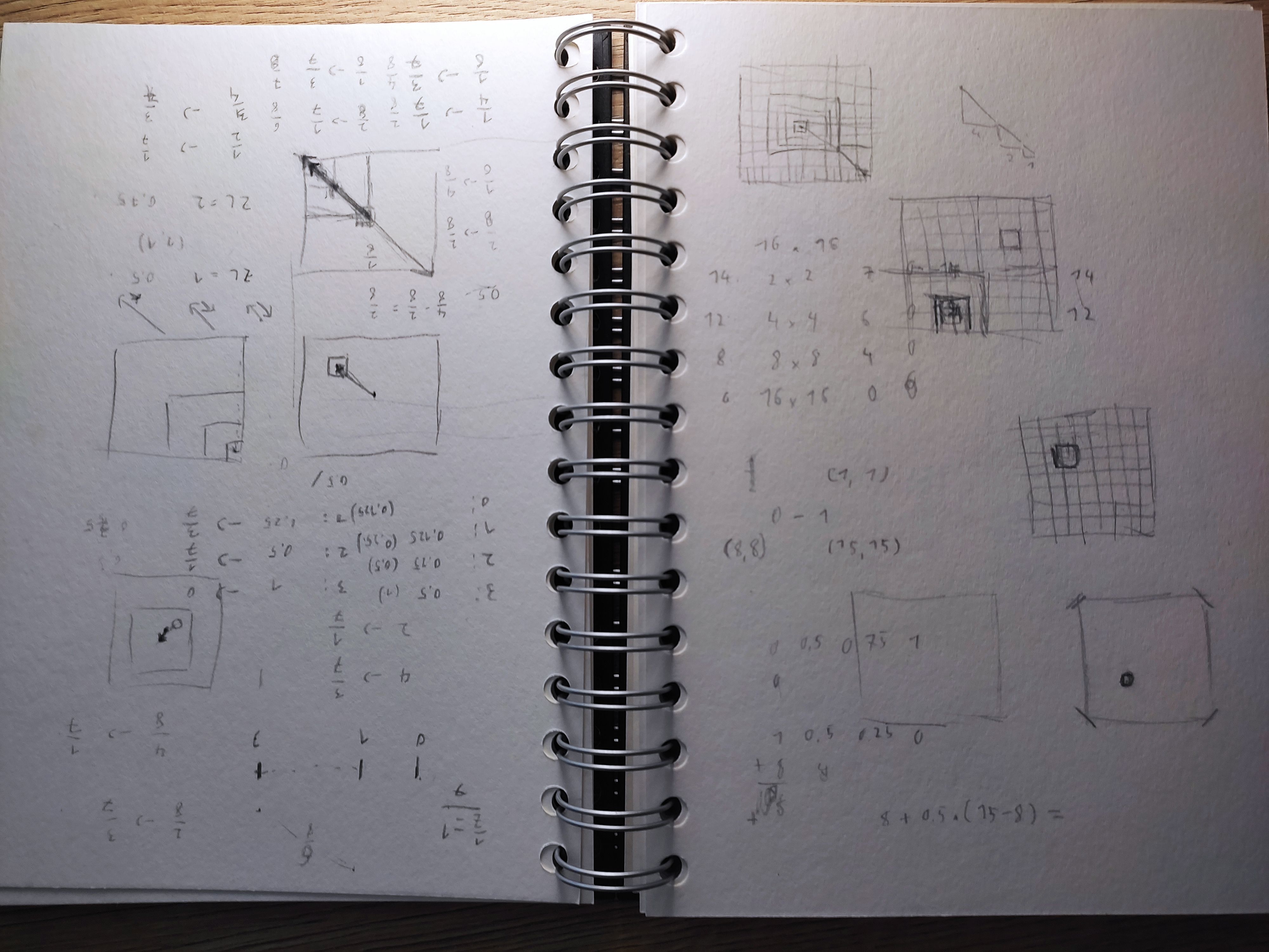
I still wasn’t quite comfortable with using 8192x8192 textures in our game. However, since we had decided that the player should only be able to zoom towards certain spots in each room, there was a nice hack to avoid that: Take a 1024x1024 clip of the main image around the target destination, mipmap the image once, repeat. That way, one (uncompressed) 256MB texture could be turned into – depending on the number of exits in a room – 3 to 7 4MB textures. A size reduction of ~90-95%. Neat!

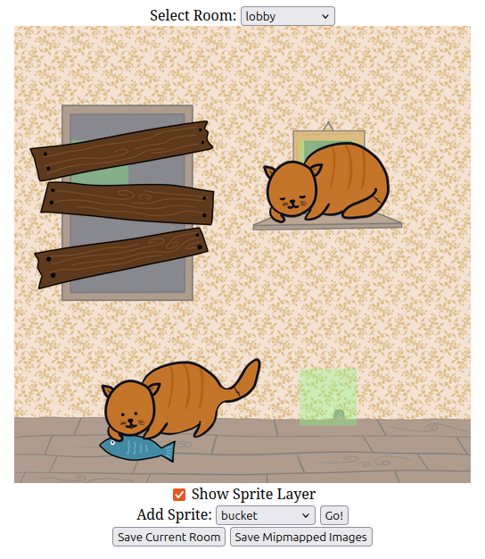
To implement that, I wrote a small cli script which ended up turning into a small web-based room editor. On the plus side, that was a lot of fun (and would definitely not have been possible with 48h on the clock). On the minus side, it did take up a decent chunk of development time and sanity.
For the two past years, we had used a custom JS-based game engine powered by THREE.js for rendering. I had originally intended to use Godot this year in order to learn it a little better, but after looking at our requirements, I decided that I felt more comfortable doing it in our custom engine one more time (mainly because I have no idea how memory management works in Godot and none of the other stuff seemed to require a higher-level engine). Oh well, maybe next year!

One technical decision I made pretty early on was to render backgrounds using a single mesh with a custom shader that calculated offsets instead of changing camera parameters. I ended up regretting that a lot when it came to adding sprites to our game. Took me about half a working day to get sprite positioning right, which I could have easily had outsourced to THREE.js. Oops. Trying to reinvent the wheel is definitely a thing I’m still doing too much.
Okay, I think I’m finally done nerding out, so let’s move on to other parts of the game:
The Art:
Psych! We’re still talking about technical aspects.
A big challenge with the artwork for our game was that we wanted transitions to feel smooth. We achieved that by starting to paint a room on the highest zoom level, scale down the painting by a factor of 8, paste it into a new image and paint the room containing the previous one around it.
While this workflow worked out pretty well in general, it had two relatively big issues:
1. In order for room transitions not to be too obvious, the edges of our low-level rooms had to be more or less a single color.
2. If we ever wanted to change something in a room, we would have to propagate the change at least two levels up.

My girlfriend started out painting the DNA room in a nice, van-Gogh-inspired style, then moved on to the next room and found that a) the transition was a bit too obvious and b) continuing in this style would take a long time, considering how many in-between images she would have to paint. We decided to try and paint rooms in a variety of art styles, which sort of worked out, but in the end, a lot of the styles ended up looking sort of similar, so maybe we should have settled on a single art style instead.
Thinking that 96 hours would be a lot of time and that the main challenge would be completing the art, I decided to also join the painting process and painted the boat on the ocean. That turned out to be a mistake, as, a) the style just differed vastly from what my girlfriend was doing and, b), it wasn’t really practical for her to continue on my painting for the upwards propagation. So I had to paint pictures up until the submarine, and since my coding adventures proved more tricky than I had expected, the quality of the artwork definitely suffered from it.
Still, all in all, considering we painted around 30 high-res paintings, I’m pretty happy with how the art turned out. Our process worked pretty well for making smooth transitions and it only fails at a couple of transitions because of sprite issues. It definitely was a little tedious, though, and if we do make another game like this one day, streamlining this process seems a crucial aspect.
Oh, and one more fun fact about the music: We spent around 3 hours searching for a fitting synth sound in Ableton, finally ended up layering a voice synth and a pan flute and afterwards my girfriend recorded the whole piece in, like, half an hour? She’s amazing.
The Gameplay:
Since we had to have a pretty good idea of the room layout from the very beginning, we ended up doing pretty much all the puzzle design Saturday evening. Not really a lot to say here, I think it turned out pretty well and people seemed to agree, resulting in our highest enjoyment rating so far. The only thing that I’m not entirely happy about is that almost all puzzles boil down to „collect X to use it at point Y“, which I know is a trope of the genre, but I think there’s still untapped potential to do more interesting puzzles here.
One thing that didn’t work out as well was the control scheme, which was probably due to me being the only one who tested it up until Monday evening. At that point, my girlfriend tried it for the first time and found that it didn’t always go where she wanted it to go, especially on the moon surface fork. I hadn’t taken Tuesday off from work, so we deemed it too late to fix, unfortunately. Even then, we didn’t realize just how bad it was until we watched someone playing our game on YouTube and repeatedly failing to go where they wanted to.
There were also two minor logic bugs we didn’t catch during playtesting, as well as a couple of missing sounds. We pushed a small post-jam update to fix both of them and make the room transitions a bit more lenient, enabling you to switch target rooms up until a zoom factor of 2x, which I think is a big improvement already. Still, for a potential follow-up project, we might want to take another look at the system.
Also, lesson learned: Get other people to playtest your controls early on. You might know how they work and what to do when they don’t do what you want them to, but other people won’t,
(I say lesson learned, but I will probably make the same mistake again next year. Oh well)
The Conclusion:
So, is our game dead? I mean, yeah, probably, in the sense that we won’t do any more updates. But we’re not necessarily done with the idea yet.
Apart from a decent amount of jam ratings and generally very positive feedback, our game was also shared on two escape game sites, giving us an unexpected amount of visitors and making it quickly climb towards our game with the second highest view count in spite of very little marketing. As far as we can tell from Google Translate, generally those reviews have also been relatively favourable, so we defnitely seem to have hit a (niche?) market with our game.
And honestly, that makes me want to do another one like this, maybe with more involved puzzles, multiple pictures, maybe some more mechanics, a noir mystery storyline … but I’m getting ahead of myself. For now, let’s just say I’m very happy with how well this game has done and I’m very grateful to everyone who left feedback in any way. Maybe we’ll see each other for another game!
Best
Lukas
Get Zoom Escape
Zoom Escape
All the Small Things (and the Large Things, too)
| Status | Released |
| Author | LukasWho |
| Genre | Puzzle, Adventure |
| Tags | 2D, Escape Game, Exploration, Game Maker's Toolkit Jam, Hand-drawn, Mouse only, Point & Click, Singleplayer, Surreal |
| Languages | English |
| Accessibility | Textless |
More posts
- Zoom Escape v0.2.1 -- The Report of my Death Was an ExaggerationAug 31, 2024
- Zoom Escape v0.2.0 -- Post-Jam FixesAug 27, 2024
Leave a comment
Log in with itch.io to leave a comment.